
Who is our client - Purple?
Context
In 2023, Purple asked us at AKQA to redesign their website. I was part of the UX team at AKQA.
Client Brief
Optimize UX/UI designs to bolster up-selling and enhance both engagement and conversion rates
Before & After Designs
Previous Experience
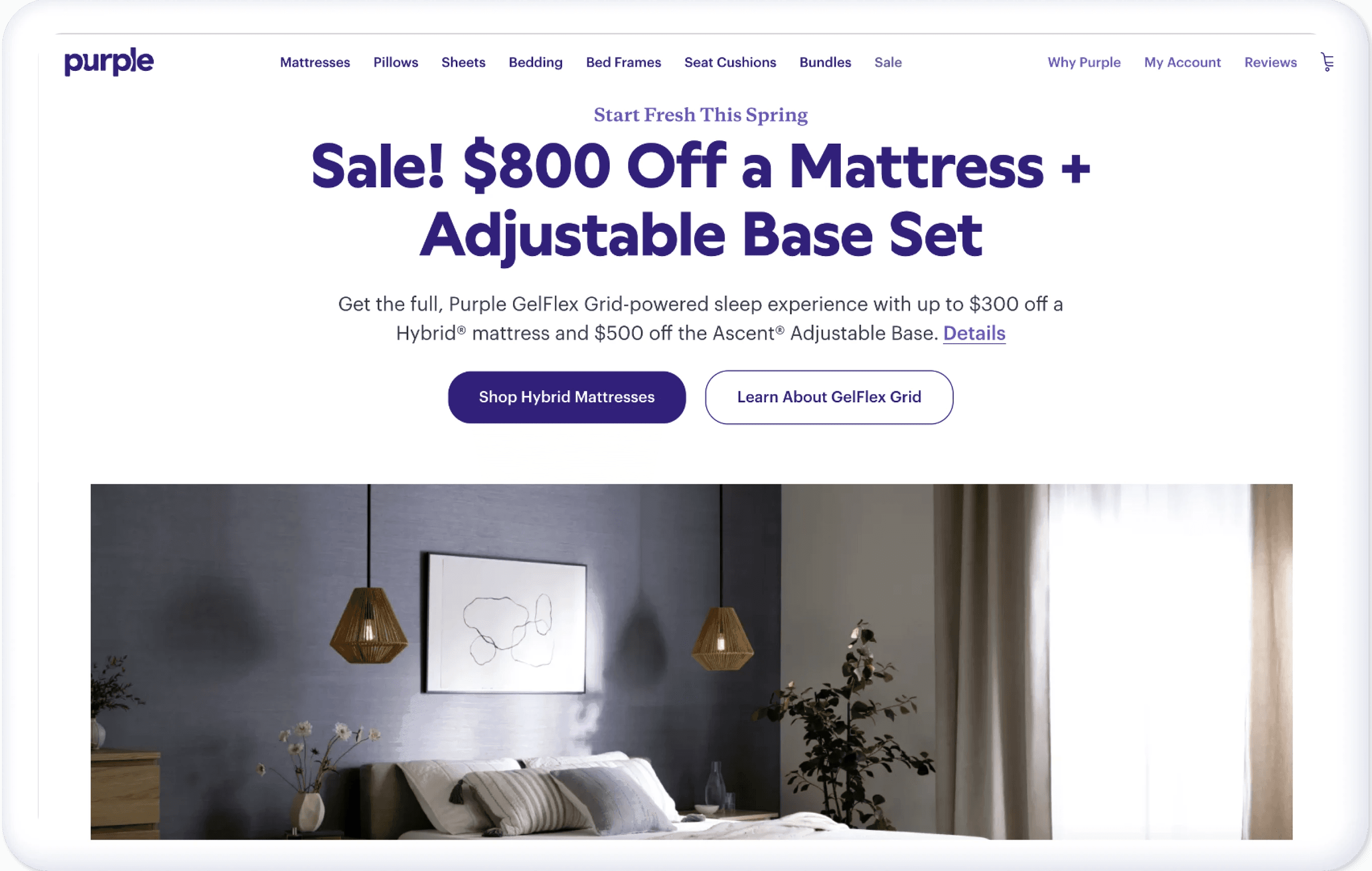
Sales-heavy, lacking a premium feel, which makes it less inviting and informative for new users
Current Experience
Focuses on delivering a premium brand image, articulating the unique 'Why Purple' story, and highlighting consumer benefits and features
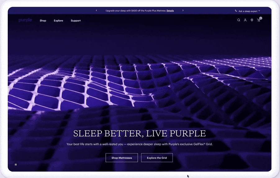
Previous Experience
Lacked interactivity. Users had difficulty understanding the unique benefits of the Purple Mattress.
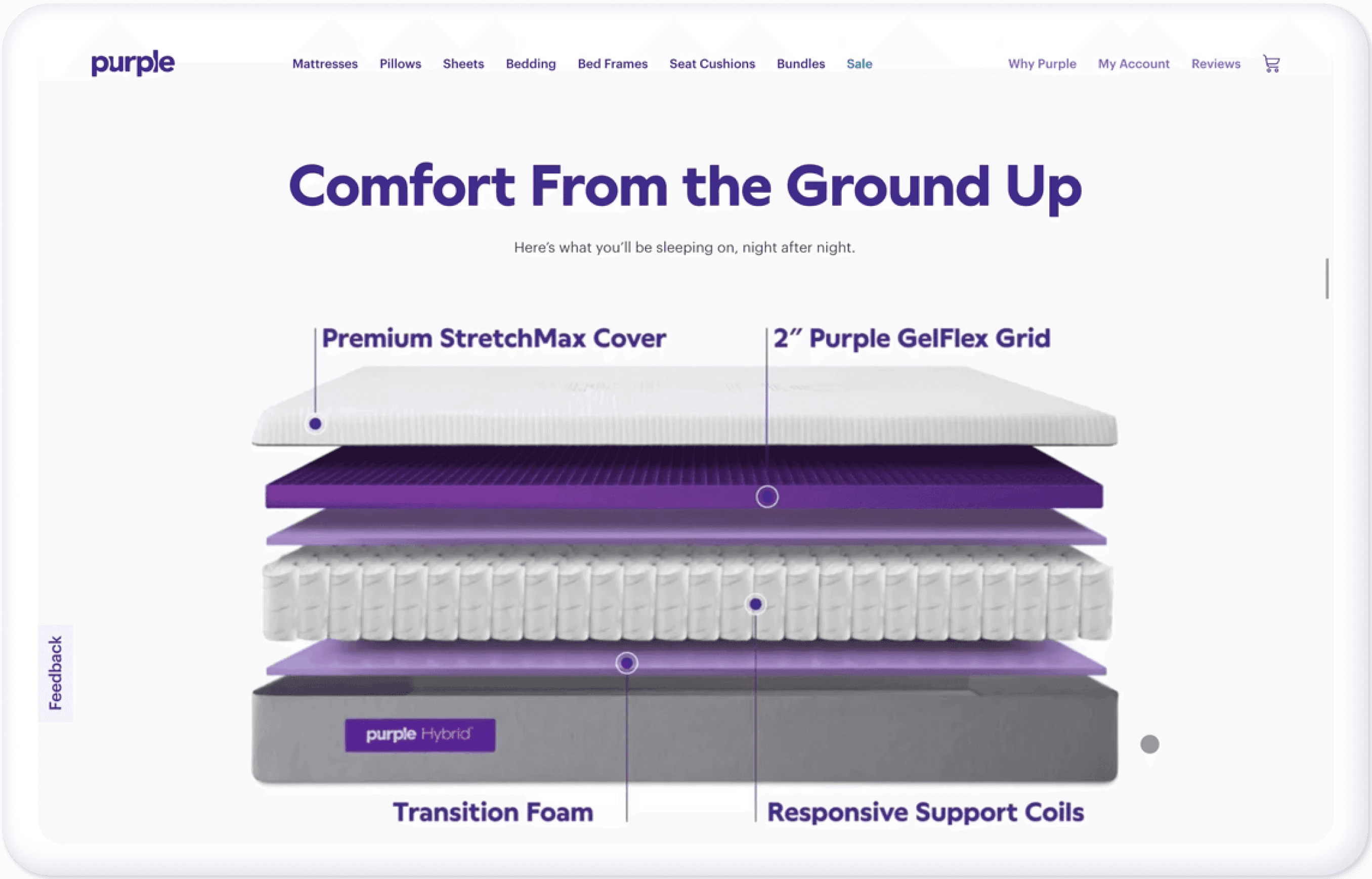
Current Experience
Shows what's inside a Purple Mattress layer by layer, emphasizing both product benefits and features.
Final Results
Business Impact
08%
Add-to-Cart rates on Product Detail Page increased by 8%
17%
Average Order Value increased by 17%
Experience Impact
12%
Top Product Detail Page views increased by 12%
15%
Average Session Duration increased by 15%
Design Process
Discover
Who are we designing for?

Mattress Preferences
Tech Supported
Health Benefits
Occupation
High-earning professional
Key Moment of Truth
Why Purple?
What is the Purple GelFlex Grid? What benefits does Purple deliver?
What does the product feel like?
Which mattress model is right for me?
Give me a reason to believe what you are saying.
Any business requirements for this redesign?

Nudge users toward the luxury line

Shift the brand image from a tech-focused to a lifestyle-oriented brand
UX Audit of Current Website
I conducted a UX audit across six pages on the Purple website. Some sample problems I found are as follows:

Current Problems
1
New users have a hard time relating to promotional information
2
Key information is hidden
3
Traditional visuals won’t make Purple stand out from its competitors
4
Content is product-driven
Define

Final Design & Iteration
Solution 1: How to efficiently inform new users about Purple's benefits
At a higher level, I redesigned the homepage content structure to better cater to the diverse needs of both new and returning users.

For new users, I prioritized the 'Why Purple' section to highlight the great benefits of Purple and enhance brand education.
For returning users, I elevated the 'Financial Information' section to encourage them to make purchase decisions.
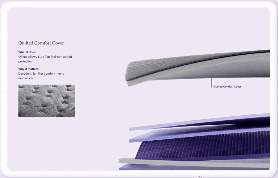
At a detailed level, I added an interactive 'Why Purple' module to inform users of the benefits.

With the horizontal carousel design, users can slide right to view more or slide down to skip the brand education content.
Solution 2: Assist returning users in finding models that suit their needs.
At a higher level, I added a new layer to the information architecture to better navigate users to preferred pages


After
Users can first find the collections they want to land on. With less information, it's also easier for them to make decisions and find their desired page.
At a detailed level, I built various charts to compare mattresses and highlight the benefits of each one

I built several lo-fi versions to compare the differences between mattresses within the collections. I considered a narrative that includes both features (like mattress height) and benefits (such as support level). With these three versions, I arrived at my final solutions.

Modules in Final Designs

Takeaway & Team Colloboration

While conceptualizing and executing the hero video for Purple's homepage, I collaborated with PMs, engineers, copywriters, and content strategists to ensure optimal accessibility, a superior user experience, and alignment with our business goals